FACSPy.pl.cluster_abundance#
- FACSPy.pl.cluster_abundance(adata, groupby, cluster_key=None, normalize=True, order=None, figsize=(5, 4), return_dataframe=False, return_fig=False, ax=None, show=True, save=None)#
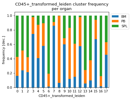
Plots the frequency as a stacked bar chart of a grouping variable per cluster.
- Parameters:
adata (
AnnData) – The anndata object of shape n_obs x n_vars where rows correspond to cells and columns to the channels.groupby (
str) – controls the x axis and the grouping of the data points.cluster_key (
Optional[str]) – The obs slot where the clusters of interest are stored.normalize (
bool) – If True, normalizes the frequencies to 1. If False, the y-axis represents the cell counts per cluster.order (
Optional[list[str]]) – Sets the order of the groupby variable.figsize (
tuple[float,float]) – Contains the dimensions of the final figure as a tuple of two ints or floats.return_dataframe (
bool) – If set to True, returns the raw data that are used for plotting as a dataframe.return_fig (
bool) – If set to True, the figure is returned.ax (
Optional[Axes]) – AAxesto created from matplotlib to plot into.show (
bool) – Whether to show the figure. Defaults to True.save (
Optional[str]) – Expects a file path including the file name. Saves the figure to the indicated path. Defaults to None.
- Return type:
Optional[Figure,Axes,DataFrame]]- Returns:
If show==False a
AxesIf return_fig==True a
FigureIf return_dataframe==True a
DataFramecontaining the data used for plotting
Examples
import FACSPy as fp

dataset = fp.mouse_lineages()

fp.settings.default_gate = "CD45+"
fp.settings.default_layer = "transformed"

fp.tl.pca(dataset)
fp.tl.neighbors(dataset)
fp.tl.leiden(dataset)

fp.pl.cluster_abundance(
    dataset,
    cluster_key = "CD45+_transformed_leiden",
    groupby = "organ"
)